
A Technical Guide for Designing Your Own Custom Brand Labels
Share
You’ve established your brand, your products are ready, and now it’s time for the most visible detail that will make direct contact with your customer: your label. But for many producers, this becomes a major point of confusion. What should the label say? Where should the logo go? What about size, font, placement, and material? It's a small area, but a huge design decision.
In this article, we’ve prepared a technical guide for boutique manufacturers who want to design their own labels from scratch, delivering professional-level results with simple steps. Even with no prior design knowledge, you can follow this information to stay on the right track.
What's the Label's Purpose? Clarify First
A label is not just a piece that carries information; it’s a surface that reflects your product's character. Sometimes the label's only purpose is to display your brand name, while other times it needs to convey details like care instructions, material content, or country of origin.
Start by asking this question: Should this label be only a logo, or should it also provide descriptive information?
If you want a simple brand tag, a smaller, folded, logo-only design is ideal.
If you need to deliver both information and brand image, you should opt for a larger, flat format or a folded structure with two distinct surfaces.
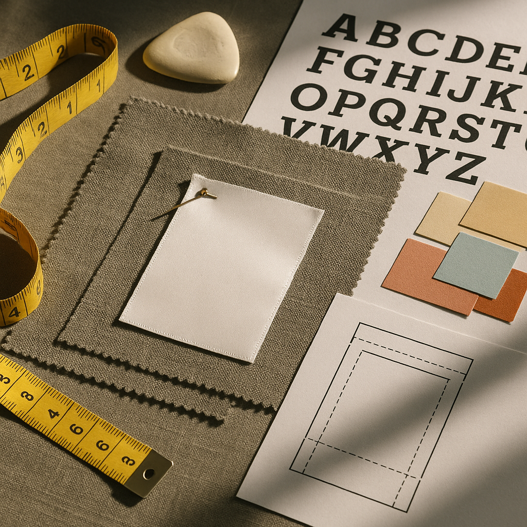
The Right Size: Not Too Big, Not Too Missed
One of the most common mistakes is making the label too large or too small relative to the product's scale. For instance, a 3x2 cm label might suffice for a baby romper, but that size could be virtually invisible on a hoodie.
General size recommendations:
For flat cotton/satin sew-in labels: Between 4x1.5 cm and 5x2.5 cm.
For folded labels (open size): Such as 4x5 cm or 3x6 cm (which results in a 4x2.5 cm folded size).
For leather tags, this size can be slightly larger, such as 6x3 cm.
The placement of the label (neckline, side seam, exterior pocket) directly influences this decision.
Font Selection: The Balance of Aesthetics and Legibility
The font you use for your logo or text content is crucial for both character and readability. Ornate, thin, and complex typefaces will lose their clarity, especially when printed at a small size. Modern, simple fonts with the correct weight look professional and won't cause printing issues. While script fonts can create a warm, personalized feel when used correctly, they must pass a rigorous readability test.
Logo Placement and Hierarchy
If the label will contain multiple pieces of information (logo, content, production data, etc.), you must establish a visual hierarchy.
The brand name should be placed at the top and in the largest size.
Supporting information can be listed below in smaller type sizes.
For folded labels, the logo should be on the outwardly facing surface, and other details should be placed on the inner face.
For leather tags, a clear, simple placement of the logo in the center yields the best result.
Color and Background Selection
High contrast between the background color and the text color ensures the print is crisp and legible. For instance, use dark text (black, navy, deep green) on light-colored labels, and light text (white, cream, gold) on dark backgrounds. The label color should also align with your brand's tone. For example, a beige cotton label suits natural products, while a black satin label fits a modern streetwear brand.
Technical Guide to Prepare Your Files
When sending your label design to a designer or manufacturer, make sure to provide the following elements:
The logo in vector format (such as AI, PDF, or SVG).
The decided print color.
The open size, including the seam allowance (e.g., 4x2 cm + 3 mm sewing allowance).
If folded, clearly specify what content goes on the front vs. the back.
A clear explanation of any special requests: "laser engraving, hot stamping, UV printing," etc.
With this information, the manufacturer can technically understand your vision and ensure accurate production.
Conclusion: A Professional Label Creates a Professional Brand Image
No matter how beautiful your product is, if the presentation is lacking, the full perception won't be achieved. A well-designed label demonstrates your brand's seriousness, aesthetic strength, and attention to detail. Using the technical information shared in this article, you can prepare a professional label, whether working solo or with a designer.
If you're ready to start the process but don't know where to begin, Labelish is here to support you with both technical consultation and personalized label production.